Printing, Part Three
Or everything I've learned about getting consistent color with Photoshop, a PowerBook G4, and an Epson R1800.
(See also: part one and part two.)
The Image
I assume you have a photo to print. Do your normal post-processing.
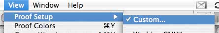
When you are ready to make a print, take advantage of Photoshop's soft proofing tools. Duplicate your image, then under the "View" menu choose "Proof Setup," then "Custom." Did I mention that you should work on a copy of your image? This is where you are glad you bought the extra-large hard drive.
Choose the ICC profile for the paper you are using in the "Device to Simulate" menu. This is why you really want ICC profiles for your paper; without the profiles, you'll have to check color by making actual prints.
You should see the appearance of your image change. Make sure the "Simulate Paper Color" and "Black Point Compensation" checkboxes are selected. Now select each of the different rendering intents and see how they change the appearance of your photo. Rendering intents are part of the baffling, mystical aspects of color that you may or may not find fascinating. You should notice that some intents, like Perceptual and Relative Colorimetric, preserve the relative relationships between tones in your image, and therefore tend to be more pleasing. The Absolute Colorimetric and Saturation intents make more drastic changes to color relationships.
I like to do this with the original image and a copy side by side. Select the rendering intent that gets you closest to the appearance you want on a specific paper (output device in Photohop's term).
Via soft proofing, Photoshop can simulate the appearance of the print using the paper and rendering intent you select. Without doing this, I have no idea how to get the color even remotely close. You can toggle soft proofing on and off with the command / control Y key combination, or via the "View" menu.
Remember which rendering intent you choose; you'll need it later in the printing process.
After setting up the soft proof, the tones in your image may still be off. Make final adjustments for print via adjustment layers. Most commonly, I'll need to adjust the black and white points for high contrast images to compensate for the differences between screen and paper images. Skintones may need tweaking to bring them back to neutral. In more difficult images, a color cast may not translate well to paper and will require more extensive adjustment. This seems to particularly true of images with strong green or yellow casts; I'd love to understand more about this and how to handle it more deftly.
Finally, take advantage of Photoshop's gamma warning feature "View -> Gamut Warning" too see what colors in the image can't be reproduced with the paper (device) you have selected. Photoshop and / or the printer driver will handle the out of gamut colors for you in one of several ways depending on the rendering intent you choose. If Photoshop shows no out of gamut colors, or just a bit out of gamut, don't worry about it. If significant parts of the image are out of gamut, you'll want to deal with the issue, or the out of gamut sections are likely to look like ass in the final print.
At this point you should have an image that looks good when soft proofed for the paper you are using. This was the hard part; the rest is mostly mechanical. I'd suggest saving a copy of the image with adjustments so you don't have to do this all again the next time you want to print the photo.
posted by Eric Hancock at
3:47 AM
![]()
![]()

0 Comments:
Post a Comment
<< Home