I've been playing with a Dell Precision M65 for a couple of days.
It shipped with with Windows Vista; this is my first experience with Vista. First impression?
What a piece of crap.
Actually, the experience had some interesting contrasts, but more on that later. To be fair, lets get the good stuff out of the way. On this brand new and quite powerful hardware, the OS seems fast and responsive. Except when starting up or shutting down, both of which take so long in Vista that something seems terribly wrong.
Now to the crap.
All of you tech journalists who wrote glowing "Aero is awesome!" reviews were clearly smoking crack. Or taking money from Microsoft. Aero is certainly not awesome. In terms of design and usability, the Vista interface is terribly disappointing. Add to this the fact that the OS does little that operating systems couldn't do four years ago and one really must wonder what is going on in Washington state.
Vista's colors are garish, contrast between elements is poor, and transparency is applied to the UI seemingly without reason (why are window title bars transparent?). Combine the poor color choices with transparency and you have an even worse situation. For example, against some backgrounds, the new alt-tab function is barely readable. Visual effects are applied to some odd places, for example, when windows open. Because windows zoom open, rather than closed, everything seems a little slower to open. An odd choice.
One thing that really annoys me: each major version of Windows seems to make it more difficult to tone down the poorly chosen colors of all the elements strewn about the screen. As someone who occasionally does some color-sensitive work, all the pollution from technicolor buttons and sliders annoys the hell out of me. XP shipped with a silverish theme that helped reduce some of the clutter, but no such luck with Vista. The default themes are all awful, and changing the saturation does little to help. So I'll waste a bunch of time digging into Vista to tone down its awful UI.
So much for the colors.
Looking at how the UI functions makes me wonder whether anyone other than people in the marketing department looked at Vista before it shipped. Take the redesigned Control Panel. Cute, except that there was obviously some kind of designer disagreement during its construction. Some links in the control panel, when clicked, open the tool in place. Others pop up another window. Sometimes more than one window. It is terribly inconsistent.
How about Windows' snappy new firewall? Try to find the firewall control panel in the confusing list of items. Then try to configure how to block incoming connections. Not too bad, if a little dumbed-down. Now try to figure out how to block outgoing traffic. This is Windows, after all, king of viruses and bots. More confusing? It certainly was for me. It almost makes
Yet another odd experience: turning off your computer.
The redesigned Start menu is another one of those "what were they thinking" things in Vista.
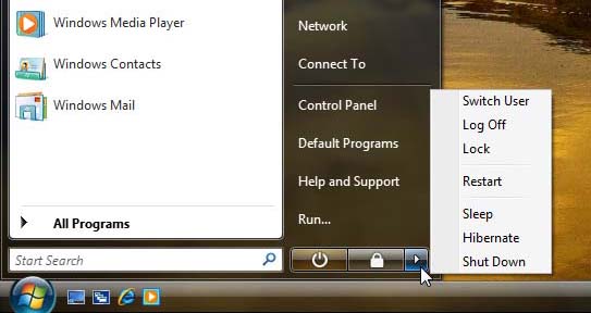
A reasonable person might think that the icon shaped like a power button would shut the computer off, but it doesn't seem to do that. Rather it puts it in hibernate mode, or sleep mode, whatever the hell the difference is.
So after you wake up the laptop, you start hunting around in the Start menu (is it still called a start menu?) for something that might turn the computer off. After some time feeling like a moron because you've been using Windows for a decade and now you can't even shut down your fucking laptop, you notice that little right-facing arrow. That couldn't possibly be it...
But it is.
Ignoring all other conventions of the new start menu, these management functions are hidden behind that stupid arrow. But what a selection of functions! Log off, switch user, sleep, hibernate, shut down. More functions must be better, right?
I understand the difference between "log off" and "switch user" on a techie, intellectual level, but, God dammit, they are the same thing and don't require two menu items. "Sleep" versus "hibernate" are remnants of the awful laptop support baked into Windows 2000 and never should have made their way to Vista. This is the operating system that monitors usage and rearranges blocks on the hard drive to increase read efficiency; surely all those geeks in Redmond could create "sleep" code that seamlessly hibernated the system after a period of time. Or something. Or anything. But we really don't need these two items, either.
Don't get me started on that farce called UAC. Microsoft somehow managed to make something remarkably annoying that does absolutely nothing to increase computer security. Within hours of using Vista, everyone will learn to reflexively click "Allow" on these jerky dialogs. Quite remarkable. [for even more boneheaded fun, locate some normal executable, say, Notepad, change its name to "setup" and watch UAC assume it requires admin privileges to run. Brilliant!] UAC truly looks like some kind of software parody. I can't believe this shipped.
The whole "experience" of Vista stinks of being designed by a very large committee composed largely of people who have no idea how to create software but who all fancy themselves "architects."
I'm focusing so much on UI features because Microsoft focuses on them in Vista, and because so few other useful features were added to Vista.
Now to the interesting contrasts.
After getting Vista set up, I downloaded an Ubuntu 7.0.4 live CD and burned it to a disk. Popped in the Dell's CD drive, the latest version of Ubuntu linux booted to a full, working OS. Ubuntu's installer was able to resize the existing NTFS partition, add two partitions for itself, and install the OS flawlessly.
To my shock and delight, on rebooting the machine I discovered that the the Ubuntu installer not only correctly configured Grub as the bootloader, but also set up an entry for the Vista partition. Very slick, if you ask me.
Ubuntu manages to boot in seconds on the same hardware the Vista labors over for more than a minute. Ubuntu also supports most of the eye candy that Vista does, but has somehow applied it in a far more tasteful, more user-focused way. My Ubuntu ID isn't a superuser id, so when I do something that requires superuser privileges, Ubuntu actually asks me for a password (imagine that), rather than a ridiculous confirmation.
That Ubuntu, a free operating system running free software, competes so well with the latest version of Windows, a product of the planet's most powerful software company, speaks to how mature free software has become.
Microsoft should be ashamed and Ubuntu's developers should be quite proud.
It shipped with with Windows Vista; this is my first experience with Vista. First impression?
What a piece of crap.
Actually, the experience had some interesting contrasts, but more on that later. To be fair, lets get the good stuff out of the way. On this brand new and quite powerful hardware, the OS seems fast and responsive. Except when starting up or shutting down, both of which take so long in Vista that something seems terribly wrong.
Now to the crap.
All of you tech journalists who wrote glowing "Aero is awesome!" reviews were clearly smoking crack. Or taking money from Microsoft. Aero is certainly not awesome. In terms of design and usability, the Vista interface is terribly disappointing. Add to this the fact that the OS does little that operating systems couldn't do four years ago and one really must wonder what is going on in Washington state.
Vista's colors are garish, contrast between elements is poor, and transparency is applied to the UI seemingly without reason (why are window title bars transparent?). Combine the poor color choices with transparency and you have an even worse situation. For example, against some backgrounds, the new alt-tab function is barely readable. Visual effects are applied to some odd places, for example, when windows open. Because windows zoom open, rather than closed, everything seems a little slower to open. An odd choice.
One thing that really annoys me: each major version of Windows seems to make it more difficult to tone down the poorly chosen colors of all the elements strewn about the screen. As someone who occasionally does some color-sensitive work, all the pollution from technicolor buttons and sliders annoys the hell out of me. XP shipped with a silverish theme that helped reduce some of the clutter, but no such luck with Vista. The default themes are all awful, and changing the saturation does little to help. So I'll waste a bunch of time digging into Vista to tone down its awful UI.
So much for the colors.
Looking at how the UI functions makes me wonder whether anyone other than people in the marketing department looked at Vista before it shipped. Take the redesigned Control Panel. Cute, except that there was obviously some kind of designer disagreement during its construction. Some links in the control panel, when clicked, open the tool in place. Others pop up another window. Sometimes more than one window. It is terribly inconsistent.
How about Windows' snappy new firewall? Try to find the firewall control panel in the confusing list of items. Then try to configure how to block incoming connections. Not too bad, if a little dumbed-down. Now try to figure out how to block outgoing traffic. This is Windows, after all, king of viruses and bots. More confusing? It certainly was for me. It almost makes
ipfw look easy. [to be fair, my OS of choice, MacOS X, doesn't make this any easier] If you do dig down deep enough to figure out how to manage outgoing connections, you'll see that outbound filtering is already enabled, but not blocking any traffic.Yet another odd experience: turning off your computer.
The redesigned Start menu is another one of those "what were they thinking" things in Vista.
A reasonable person might think that the icon shaped like a power button would shut the computer off, but it doesn't seem to do that. Rather it puts it in hibernate mode, or sleep mode, whatever the hell the difference is.
So after you wake up the laptop, you start hunting around in the Start menu (is it still called a start menu?) for something that might turn the computer off. After some time feeling like a moron because you've been using Windows for a decade and now you can't even shut down your fucking laptop, you notice that little right-facing arrow. That couldn't possibly be it...
But it is.
Ignoring all other conventions of the new start menu, these management functions are hidden behind that stupid arrow. But what a selection of functions! Log off, switch user, sleep, hibernate, shut down. More functions must be better, right?
I understand the difference between "log off" and "switch user" on a techie, intellectual level, but, God dammit, they are the same thing and don't require two menu items. "Sleep" versus "hibernate" are remnants of the awful laptop support baked into Windows 2000 and never should have made their way to Vista. This is the operating system that monitors usage and rearranges blocks on the hard drive to increase read efficiency; surely all those geeks in Redmond could create "sleep" code that seamlessly hibernated the system after a period of time. Or something. Or anything. But we really don't need these two items, either.
Don't get me started on that farce called UAC. Microsoft somehow managed to make something remarkably annoying that does absolutely nothing to increase computer security. Within hours of using Vista, everyone will learn to reflexively click "Allow" on these jerky dialogs. Quite remarkable. [for even more boneheaded fun, locate some normal executable, say, Notepad, change its name to "setup" and watch UAC assume it requires admin privileges to run. Brilliant!] UAC truly looks like some kind of software parody. I can't believe this shipped.
The whole "experience" of Vista stinks of being designed by a very large committee composed largely of people who have no idea how to create software but who all fancy themselves "architects."
I'm focusing so much on UI features because Microsoft focuses on them in Vista, and because so few other useful features were added to Vista.
Now to the interesting contrasts.
After getting Vista set up, I downloaded an Ubuntu 7.0.4 live CD and burned it to a disk. Popped in the Dell's CD drive, the latest version of Ubuntu linux booted to a full, working OS. Ubuntu's installer was able to resize the existing NTFS partition, add two partitions for itself, and install the OS flawlessly.
To my shock and delight, on rebooting the machine I discovered that the the Ubuntu installer not only correctly configured Grub as the bootloader, but also set up an entry for the Vista partition. Very slick, if you ask me.
Ubuntu manages to boot in seconds on the same hardware the Vista labors over for more than a minute. Ubuntu also supports most of the eye candy that Vista does, but has somehow applied it in a far more tasteful, more user-focused way. My Ubuntu ID isn't a superuser id, so when I do something that requires superuser privileges, Ubuntu actually asks me for a password (imagine that), rather than a ridiculous confirmation.
That Ubuntu, a free operating system running free software, competes so well with the latest version of Windows, a product of the planet's most powerful software company, speaks to how mature free software has become.
Microsoft should be ashamed and Ubuntu's developers should be quite proud.
posted by Eric Hancock at
5:13 PM
![]()
![]()

1 Comments:
Very True, Ubuntu FTWin and disappearing DVD and CD drives in Vista FTFWanker.
Bill getting to old FTS!!!!
By Anonymous, at 7:39 PM
Post a Comment
<< Home