Swimming with the Razorfishes

Friday, April 14, 2006

Printing, Part Five

Or everything I've learned about getting consistent color with Photoshop, a PowerBook G4, and an Epson R1800.

(See also: part one, part two, part three, and part four.)

Viewing the Print

This is the fun part. You have made a photograph, worked on the image, and made your print.

Once the printer finishes its work, however, yours isn't done. At least, that is, if you are particular about print quality.

I mentioned that prints should dry flat for a day or so before you allow anything to contact the print surface. You should also allow the print some dry-down time before judging its quality. Inks can undergo subtle color shifts while drying, so let the print rest a bit.

View your prints under diffused, full spectrum light. While this seems complicated, for me it means I wait until daylight before making final decisions about print color or quality. Because I do most of my printing at night, I'm depending on artificial light, light that tends to be a little too warm (more red than blue) and not quite bright enough. My prints always look different in daylight. What looked like pure black under a halogen light shows subtle detail in afternoon light. Consider the quality of light where you are doing your printing.

Also be aware of the differences between viewing a print on a monitor, which produces light, and viewing the same print on paper, which reflects light. Neither on-screen images nor printed images should be critically viewed in dim light or bright direct light. The luminous nature of the display and the reflective nature of the printed image will both look off in these conditions; another good reason to withhold judgement until you have the benefit of good illumination.

Printing, Part Four

Or everything I've learned about getting consistent color with Photoshop, a PowerBook G4, and an Epson R1800.

(See also: part one, part two, and part three.)

The Print

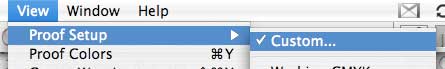
If you are following me this far, you have bought a printer and some papaer, and have soft-proofed an image. Now resize your image to match your paper size. The print dialog will also allow you to change the image size, but you'll have more control if you use the resize function. When resizing, pay attention to the resolution. When resizing for a final print, make sure you can resize to at least 240 DPI. 360 DPI is even better.

Photoshop has about five print options. Choose the "Print with Preview..." item. This dialog allows you to check most of the settings that influence color reproduction.

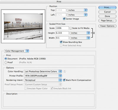
This is also where things get a little OS X and Epson specific. From the "Print with Preview" dialog, click the "Print Preview" button. Make sure your printer is the one selected. Also verify the paper size. This is also where you'll specify whether your are using the standard sheet feeder, the manual feed, or roll paper. If the wrong printer is selected, you'll have difficulty positioning the image accurately on paper. If the wrong paper size is selected, you'll have trouble using the manual feed.

Once you have checked your printer and paper size, close the "Print Preview" dialog. Make sure the "Color Management" menu item is selected. Then verify that the "Document" radio button is selected -- you want to make a final print, not proof the image as it would appear on another device. Select "Let Photoshop Determine Colors" in the "Color Handling" menu. Select your printer's profile in the "Printer Profile" menu. Select the same rendering intent you selected in the soft proof dialog in the "Rendering Intent" menu. If you proofed with black point compensation, verify that it is selected. This is all fairly mechanical, but important.

Verify the positioning of your image on the printed page, then click the "Print..." button.

The standard print dialog should appear. Navigate to the "Print Setting" panel.

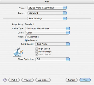
Verify that your paper is selected in the "Media Type." If your paper type isn't visible, you may have selected the wrong paper size in the "Page Setup" menu, or you might be using a paper not directly by your printer vendor. If your paper isn't listed, the paper manufacturer should have supplied information about the closest choice. For example, on my printer, Hahnemuhle Photo Rag should be printed with the "Velvet Fine Art" media type.

You may also choose to customize the print quality on this panel. On the Epson 1800, the difference between "Photo" and "Best Photo" is surprisingly small.

Important: the "Print Quality" setting should match the paper profile and type you are using. For example, the "Photo RPM" setting, intended for glossy paper, should not be used with a matte paper. If you proofed the print using a "Best Photo" profile, choose a "Photo" quality setting. Whew.

Next, navigate to the "Color Management" panel. Make sure that the "Off (No Color Adjustment) radio button is selected. This very important step ensures that the print driver won't try to adjust color in your image.

And that should be it. Make the print.

Once the print is done, give it a few minutes to dry. Then take a tip from the wet darkroom and write your print settings in pencil on the back of the print. Note the paper used, additional adjustments made during proofing, rendering intent, and media type settings. You'll likely make a number of prints and will want to compare them side by side. Writing the settings on the back helps you keep track of the differences.

Just to be safe, give your final prints lots of time to dry. They are safe to handle soon after printing, but let them dry for 24 hours before placing other prints on top of them or otherwise touching the print surface. The print surface is somewhat fragile and can scratch when wet.

Thursday, April 13, 2006

POTD

No Right
click for high-res

Magnum

Magnum Photos has expanded their multimedia content with a set of weekly video podcasts via their Magnum in Motion site. Good stuff. Worth subscribing to.

Printing, Part Three

Or everything I've learned about getting consistent color with Photoshop, a PowerBook G4, and an Epson R1800.

(See also: part one and part two.)

The Image

I assume you have a photo to print. Do your normal post-processing.

When you are ready to make a print, take advantage of Photoshop's soft proofing tools. Duplicate your image, then under the "View" menu choose "Proof Setup," then "Custom." Did I mention that you should work on a copy of your image? This is where you are glad you bought the extra-large hard drive.

Choose the ICC profile for the paper you are using in the "Device to Simulate" menu. This is why you really want ICC profiles for your paper; without the profiles, you'll have to check color by making actual prints.

You should see the appearance of your image change. Make sure the "Simulate Paper Color" and "Black Point Compensation" checkboxes are selected. Now select each of the different rendering intents and see how they change the appearance of your photo. Rendering intents are part of the baffling, mystical aspects of color that you may or may not find fascinating. You should notice that some intents, like Perceptual and Relative Colorimetric, preserve the relative relationships between tones in your image, and therefore tend to be more pleasing. The Absolute Colorimetric and Saturation intents make more drastic changes to color relationships.

I like to do this with the original image and a copy side by side. Select the rendering intent that gets you closest to the appearance you want on a specific paper (output device in Photohop's term).

Via soft proofing, Photoshop can simulate the appearance of the print using the paper and rendering intent you select. Without doing this, I have no idea how to get the color even remotely close. You can toggle soft proofing on and off with the command / control Y key combination, or via the "View" menu.

Remember which rendering intent you choose; you'll need it later in the printing process.

After setting up the soft proof, the tones in your image may still be off. Make final adjustments for print via adjustment layers. Most commonly, I'll need to adjust the black and white points for high contrast images to compensate for the differences between screen and paper images. Skintones may need tweaking to bring them back to neutral. In more difficult images, a color cast may not translate well to paper and will require more extensive adjustment. This seems to particularly true of images with strong green or yellow casts; I'd love to understand more about this and how to handle it more deftly.

Finally, take advantage of Photoshop's gamma warning feature "View -> Gamut Warning" too see what colors in the image can't be reproduced with the paper (device) you have selected. Photoshop and / or the printer driver will handle the out of gamut colors for you in one of several ways depending on the rendering intent you choose. If Photoshop shows no out of gamut colors, or just a bit out of gamut, don't worry about it. If significant parts of the image are out of gamut, you'll want to deal with the issue, or the out of gamut sections are likely to look like ass in the final print.

At this point you should have an image that looks good when soft proofed for the paper you are using. This was the hard part; the rest is mostly mechanical. I'd suggest saving a copy of the image with adjustments so you don't have to do this all again the next time you want to print the photo.

Wednesday, April 12, 2006

Printing, Part Two

Or everything I've learned about getting consistent color with Photoshop, a PowerBook G4, and an Epson R1800.

(See also: part one.)

The Paper

One of the wonderful things about ink jet printing, as compared to wet-darkroom printing, is the variety of paper available. Cool tone, natural white, glossy, pearl, satin, matte, all in a variety of textures and weights. And lots more about to be released. Great stuff.

But when you are starting out, pick one paper and learn to print well on it. Different papers respond to ink very differently, sometimes surprisingly so. As a starter paper, pick one from the company that made your printer. They will have carefully profiled the paper, ink, and printer, making good results easier. For me, this meant getting some Epson paper. I don't like glossy paper; I think it looks like ass. So I picked up a pack of the Premium Semi-Gloss and a pack of Enhanced Matte. The semi-gloss paper still feels too much like a junky RC paper, so I used very little of it. The enhanced matte is a nice paper, relatively good Dmax and good color reproduction. It isn't the cheapest possible paper (about 28 cents per 8 1/2 x 11 sheet), but it takes color well and can produce a reasonably good black. Ilford's Heavyweight Matte is a slightly less-expensive alternative that prints similarly.

As expected, Epson had a good set of color profiles for the paper. Whatever paper you choose, make sure the manufacturer supplies ICC profiles specific to the printer / ink / paper combination; you'll have a much more difficult time getting accurate color without profiles.

If you are feeling adventurous, think about getting some paper for final prints. Once you have a good print on something like Enhanced Matte, a paper like Velvet Fine Art makes a fantastic final print. Velvet Fine Art is heavier and thicker than Enhanced Matte and can reproduce more vibrant color and deeper blacks. Given the quality of Epson's profiles, it is hard to beat Velvet Fine Art. Velvet Fine Art has a rather pronounced texture. If the texture is too much for you, take a look at Moab Entrada 300. Slightly heavier than Velvet Fine Art, Entrada has a smooth texture and prints beautifully. These papers are more expensive (around $1.20 per 8 1/2 x 11 sheet) so are really only appropriate for final prints.

When you pick a paper, be sure to figure out which side is the printable side. Unless your paper is double-sided, most ink jet papers are coated on one side. This coating helps the paper accept the ink uniformly without too much dot gain.

Tuesday, April 11, 2006

POTD

Three
click for high-res

Breastwick

When your company's products consist of films like The Witches of Breastwick, the PowerPoint presentations just write themselves.

BB

"Ms. Vargas seems unfazed by her job, even though it involves being subjected to constant electronic scrutiny. Software tracks her productivity and speed, and every so often a red box pops up on her screen to test whether she is paying attention. She is expected to click on it within 1.75 seconds. In the break room, a computer screen lets employees know just how many minutes have elapsed since they left their workstations." [via The New York Times]

All I can think is, get a good education, people.

Monday, April 10, 2006

POTD

The Arm
click for high-res

Printing

Or everything I've learned about getting consistent color with Photoshop, a PowerBook G4, and an Epson R1800.

Some time ago, I purchased an Epson R1800 printer. Shortly afterward I started learning about the differences between screen color and print color. For a little while, I was really disappointed with the output: weird color casts, bad shadow density. It took some time to cobble together the (surprisingly large amount of) information necessary to make consistent, accurate photogrphicprints. I thought I'd share it in five installments: the printer, the display, the image, the print, and viewing the print.

The Printer

I did a fair amount of research regarding printers. The ink in dye-based printers seemed to fade and discolor too quickly; in a matter of years in some cases. This narrowed the field to pigment-based printers, which mostly narrowed the field to Epson printers. I also wanted to make larger format prints, further narrowing my choices, essentially to the 1800 and 2400. Looking at the differences in price and features, I chose the 1800.

Since I bought the printer, of course, things happened.

First, I understood the differences between the 1800 and 2400 a little better. Both printers use Epson's new Ultrachrome inks, pigment-based inks with excellent permanence and color safety. Both are 8-color printers. The 1800 uses matte black and a photo (glossy) black inks. The 2400 uses three shades of matte black; a photo black cartridge can be swapped in (at the cost of some ink). Even though the 2400 is about $300 more expensive, I would now buy the 2400. The three black inks will produce better monochrome prints with deeper blacks and smoother midtones.

Second, both HP and Canon have since released some nice, pigment-based printers. Canon's 10-color 9500 and HP's 9-color 8750 look quite good. Only time will tell if they match the quality and longevity of Epson's inks and printers, but all these printers bear consideration. Also note that Epson's R800 printer, while restricted to 8 1/2 x 11 paper, is otherwise the same as the 1800. This makes it a very reasonably priced, excellent printer. Also worth consideration.

No matter which printer you choose, don't forget to budget for consumables, like paper and ink. The 1800's ink consumption seems to be quite good (hundreds of 8x10 prints), but a full set of inks runs about $100. Note that each color if ink can be replaced as it runs out; you need not replace the whole set, for example, if you run out of yellow ink. Paper, too, can get expensive. Monitor calibrating hardware is also money well spent, but more on that later.